A New Line, A New System
-
Client
OC Transpo
-
Location
Ottawa, Ontario
-
Sector
Transit
-
Discipline
Wayfinding, Place Branding
-
Photography
Ben Rahn/A-Frame
-
Awards
Graphic Design USA Graphis Design Annual Silver
Riding the Rails
We began the project with a system-wide audit. We travelled through the new infrastructure and paid close attention to how, where, and when riders expected to get information. This allowed us to design a system that matched and complemented existing rider behaviours, while making adjustments to improve clarity and eliminate any risk of confusion. Our goal was to make the transition from the old to the new system as seamless and natural as possible.

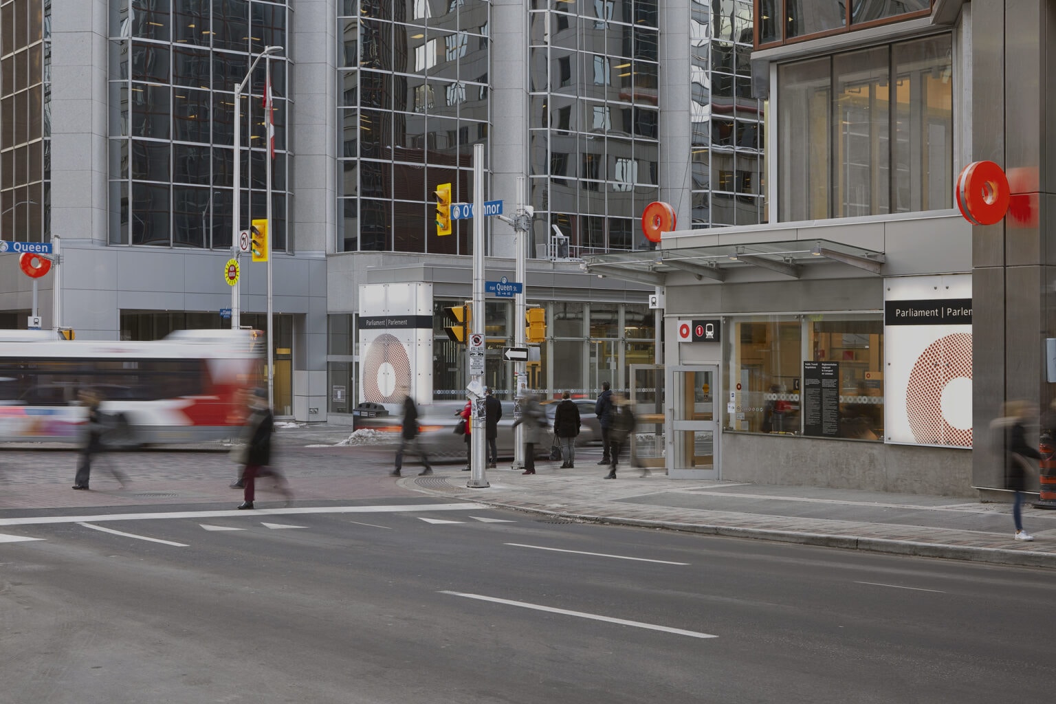
Our design philosophy was to make the system easy to understand, which begins with identifying the system itself. We made “OC Transpo” the primary brand and used the iconic red “O” as the identifier that encompassed the entire system. The “O” is a bold and easily recognizable symbol, clearly visible from almost any angle or distance. It easily became a beacon we could use to direct riders’ attention to important places and information. We further used the “O” as a playful and familiar element which could highlight different station amenities, system types, and points of interest.
Systems Inside Systems
To create a more intuitive journey through OC Transpo, Entro reorganized and redeveloped several aspects of the system’s visual communications. All the other services – bus and train lines, specialty services, connecting systems, and other sub-brands – took secondary roles in the environmental communications. This gave the system a recognizable and unified identity, as well as an easily understood message structure and hierarchy.
We simplified service hierarchies, grouping the services in a way that prioritized how riders interact with them. We also renumbered the routes, creating a consistent framework that flows logically throughout the city.
Finally, we redesigned the route map to be easier to understand for both new and experienced riders, while also including additional system information that is relevant to riders during their journey.


“Entro’s work has really put us on a solid footing ensuring we have high quality signage and wayfinding and information for our customers for years to come.”
Pat Scrimgeour, Director of Transit Customer Systems and Planning, OC Transpo

By establishing clear and concise rules, we were able to eliminate complexities and communicate important information to riders in a framework that they intuitively understand. The look and feel unifies the entire architectural and wayfinding system, yet takes advantage of the individual brand and service elements that form the system.
Visit OC Transpo to find out more about their services.
-
![Southeastern Pennsylvania Transportation Authority (SEPTA)]() Philadelphia, Pennsylvania SEPTA Branding and Wayfinding Master PlanPhiladelphia, Pennsylvania SEPTA Branding and Wayfinding Master Plan
Philadelphia, Pennsylvania SEPTA Branding and Wayfinding Master PlanPhiladelphia, Pennsylvania SEPTA Branding and Wayfinding Master Plan -
![ATB Centre]() Lethbridge, Alberta ATB Centre A New Standard for RecreationLethbridge, Alberta ATB Centre A New Standard for Recreation
Lethbridge, Alberta ATB Centre A New Standard for RecreationLethbridge, Alberta ATB Centre A New Standard for Recreation -
![Ottawa-Gatineau Pedestrian Wayfinding Feasibility Study]() Ottawa, Ontario Ottawa-Gatineau Pedestrian Wayfinding Feasibility StudyOttawa, Ontario Ottawa-Gatineau Pedestrian Wayfinding Feasibility Study
Ottawa, Ontario Ottawa-Gatineau Pedestrian Wayfinding Feasibility StudyOttawa, Ontario Ottawa-Gatineau Pedestrian Wayfinding Feasibility Study -
![National Veterans Resource Center]() Syracuse, New York National Veterans Resource CenterSyracuse, New York National Veterans Resource Center
Syracuse, New York National Veterans Resource CenterSyracuse, New York National Veterans Resource Center -
![Kansas City International Airport]() Kansas City, Missouri Kansas City Airport TerminalKansas City, Missouri Kansas City Airport Terminal
Kansas City, Missouri Kansas City Airport TerminalKansas City, Missouri Kansas City Airport Terminal -
![Artscape Daniels Launchpad]() Toronto, Ontario Artscape LaunchpadToronto, Ontario Artscape Launchpad
Toronto, Ontario Artscape LaunchpadToronto, Ontario Artscape Launchpad -
![YW Calgary Hub Facility]() Calgary, Alberta YW Calgary Hub FacilityCalgary, Alberta YW Calgary Hub Facility
Calgary, Alberta YW Calgary Hub FacilityCalgary, Alberta YW Calgary Hub Facility -
![Canalside]() Buffalo, New York CanalsideBuffalo, New York Canalside
Buffalo, New York CanalsideBuffalo, New York Canalside


